moon and milla
Moon + Milla is a fictitious brand developed in collaboration with a four-person team, created to test and showcase our ability to build a complete brand identity from the ground up. This comprehensive project included in-depth research, user surveys, rapid team decision-making, brand storytelling, sketching, prototyping, illustration, product design, color theory, a full brand style guide, editorial assets, and a finalized brand book.
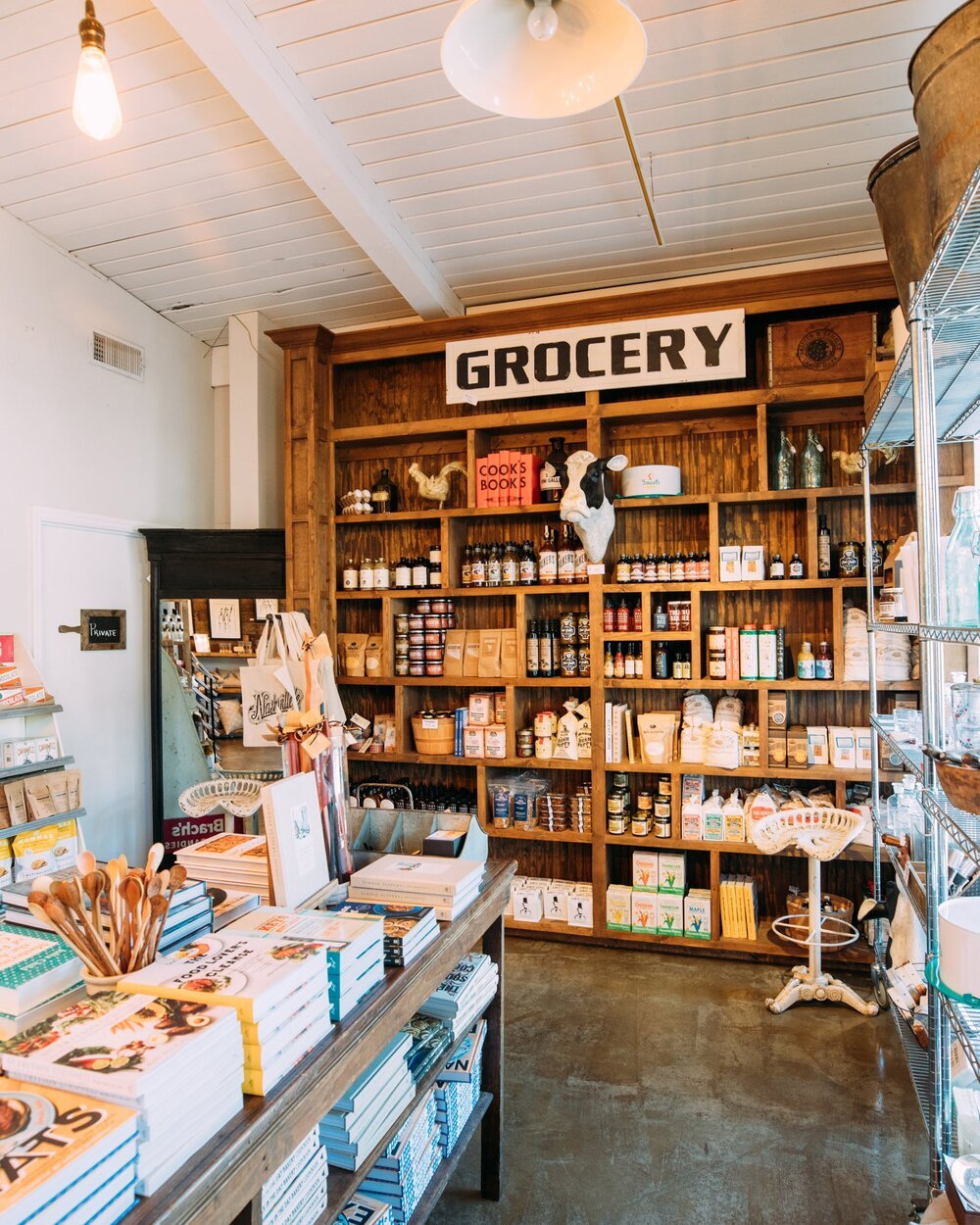
With a shared interest in natural and holistic alternatives, our team conceptualized Moon + Milla as a modern-day apothecary rooted in Midtown Sacramento, CA. The brand draws inspiration from nature, reflected in both its name and aesthetic.
Moon symbolizes balance, rhythm, and the cyclical nature of health and wellness. Milla is derived from Matricaria chamomilla, the scientific name for chamomile, a plant long associated with healing and relaxation. Together, the name embodies our mission to deliver natural care that nurtures both body and mind.
Our product offerings included personal care items, home goods and apparel, wellness products, and local community services. We defined Moon + Milla’s brand personality as sustainable, naturalistic, organic and conscious—guiding our design system across all visual and editorial elements.
This project was an exercise not just in visual design, but in collaborative storytelling—crafting a brand that feels intentional, grounded, and emotionally resonant.
Research / Branding / Editorial / Product Design / Package Design


This project was a highly collaborative effort, developed during the challenges of remote work under COVID restrictions. Despite the distance, our team maintained strong communication and a shared creative vision, which allowed each member to bring their strengths to the table and shape Moon + Milla into a cohesive, thoughtfully crafted brand.
My contributions centered around brainstorming, concept development, product design, and editorial layout. Early in the branding process, I proposed Milla as the second-half of our brand name as an alternative to our original name, Moon & Ivy. Moon + Milla better reflected our focus on natural wellness, balance, and holistic health. This became a cornerstone of the brand’s identity.
The concept for the apothecary’s logo originated from one of my early sketches. When the team decided to develop that direction further, my teammate Yolanda Magaña brought it to life with her illustration skills. Yolanda went on to illustrate the rest of our brand’s visual assets, which were featured across product packaging and our final brand book. As a team, we collaborated on packaging concepts and layout ideas, ensuring a strong, unified visual language.
